Why Cabinet Colors Matter More Than You Think
Let’s be real for a second. Your cabinets take up most of the visual real estate in your kitchen. Choose the wrong color, and you’ll be staring at a mistake every morning while making coffee. No pressure, right?
Kitchen cabinet colors aren’t just about aesthetics – they affect how big your space feels, how light bounces around, and even how clean your kitchen appears between deep cleans (we all need those little visual tricks!).
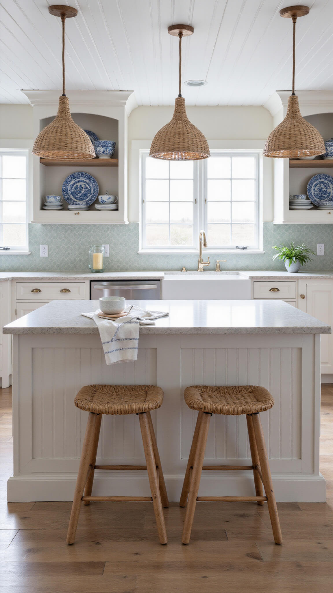
💡 Steal This Look
- Paint Color: Sherwin-Williams Naval SW 6244 for lower cabinets with Sherwin-Williams Pure White SW 7005 for uppers to create visual balance and maximize light reflection
- Furniture: light wood or white kitchen island with brass hardware to complement the two-tone cabinet approach
- Lighting: pendant lights with warm brass or black finishes to tie into cabinet hardware choices
- Materials: quartz countertops in light veining, subway tile backsplash, and brushed brass cabinet pulls
I’ve seen too many homeowners rush into trendy cabinet colors only to regret them six months later when they realize how much visual weight dark cabinets add to a small space. The right cabinet color becomes the foundation that makes everything else in your kitchen feel intentional.
Popular Kitchen Cabinet Color Ideas That Stand the Test of Time
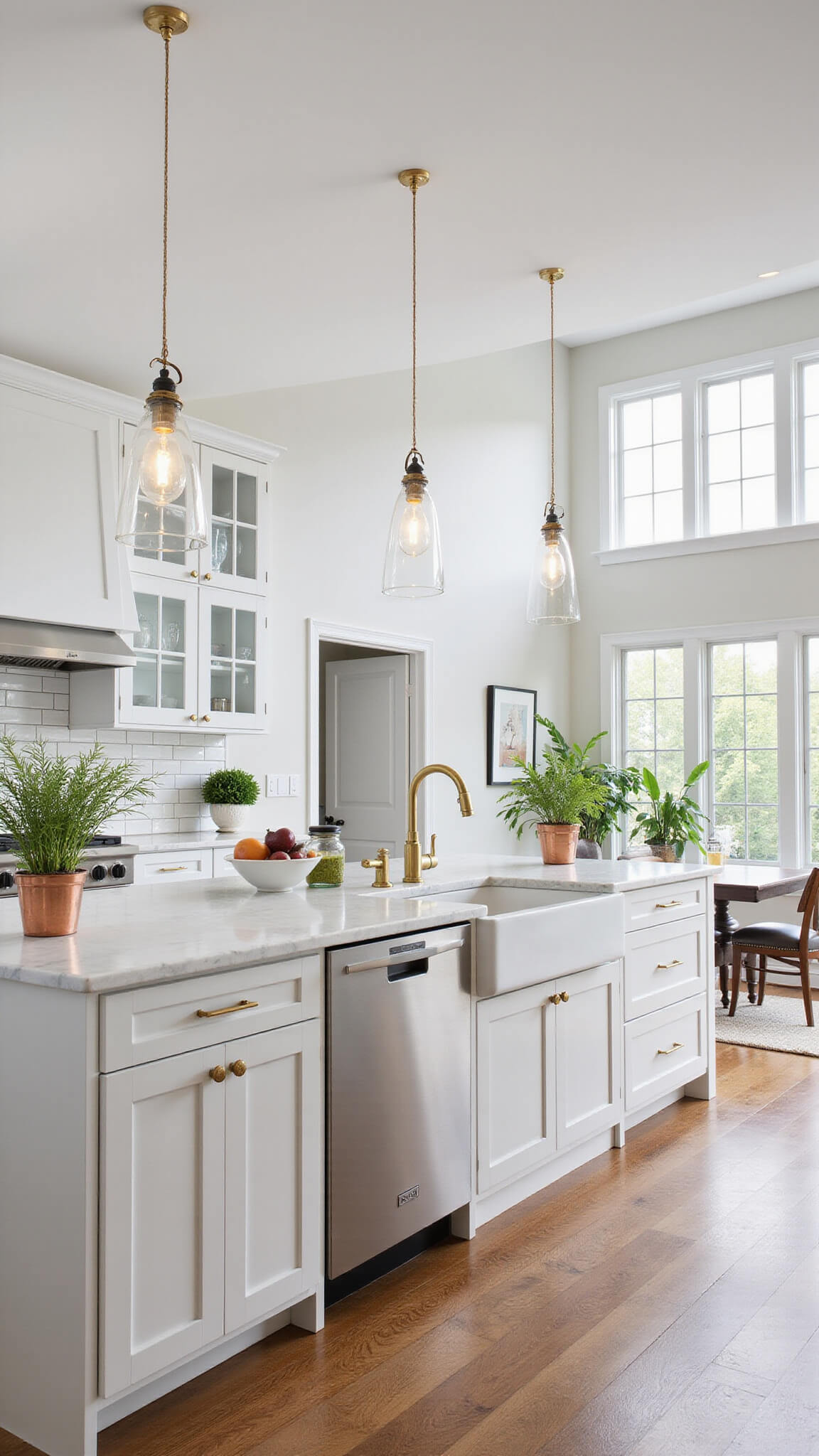
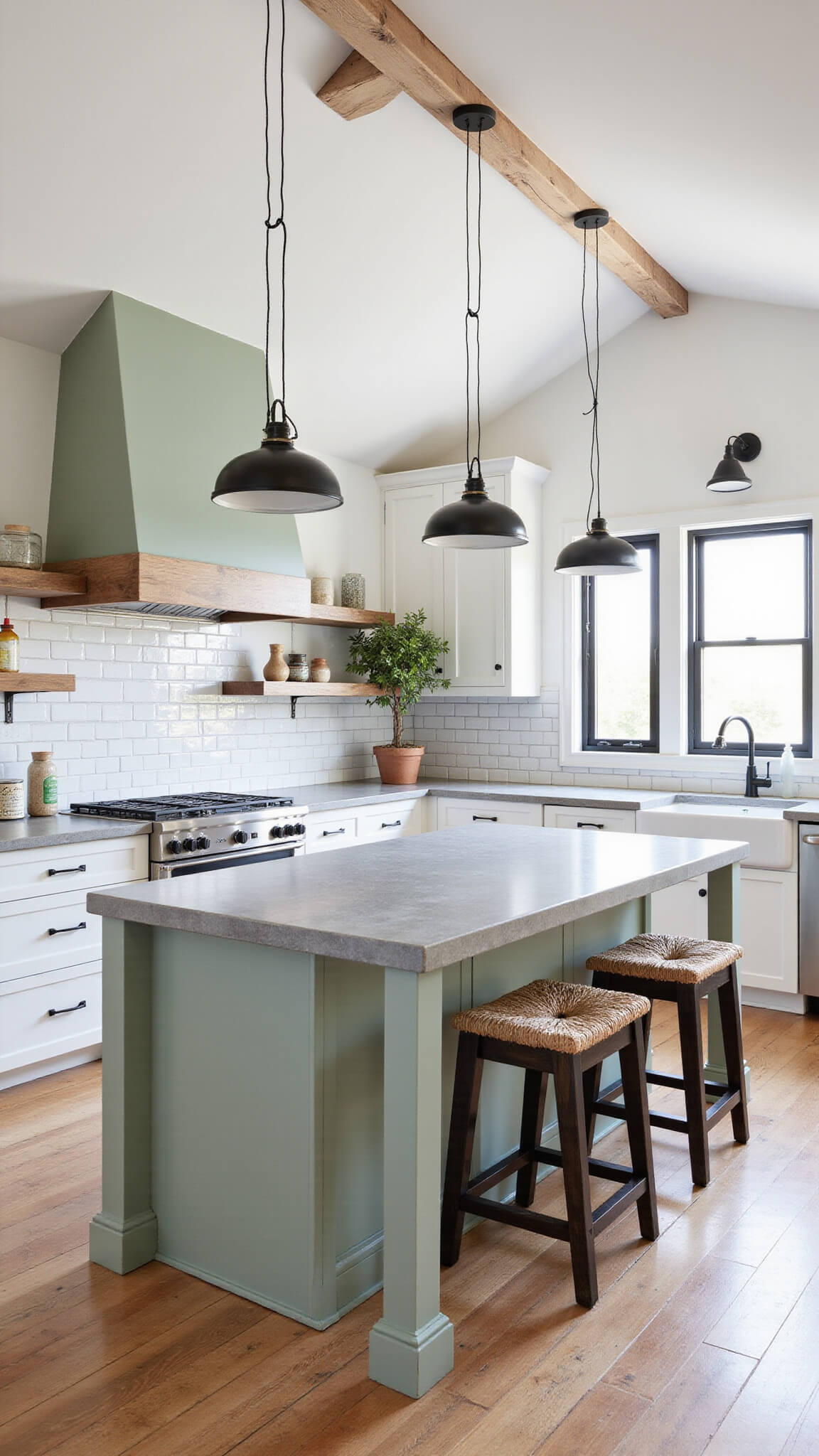
Whites and Off-Whites: The Classic Choice
Cloud Cover OC-25 and Simply White OC-117 by Benjamin Moore remain my top recommendations for a reason.
White cabinets offer:
- A timeless look that never goes out of style
- The illusion of a bigger, brighter kitchen
- A versatile backdrop for any accessories
- Easy color matching with appliances and countertops
Pro tip: If stark white seems too clinical for your taste, off-whites like cream or ivory add warmth while maintaining that clean aesthetic.
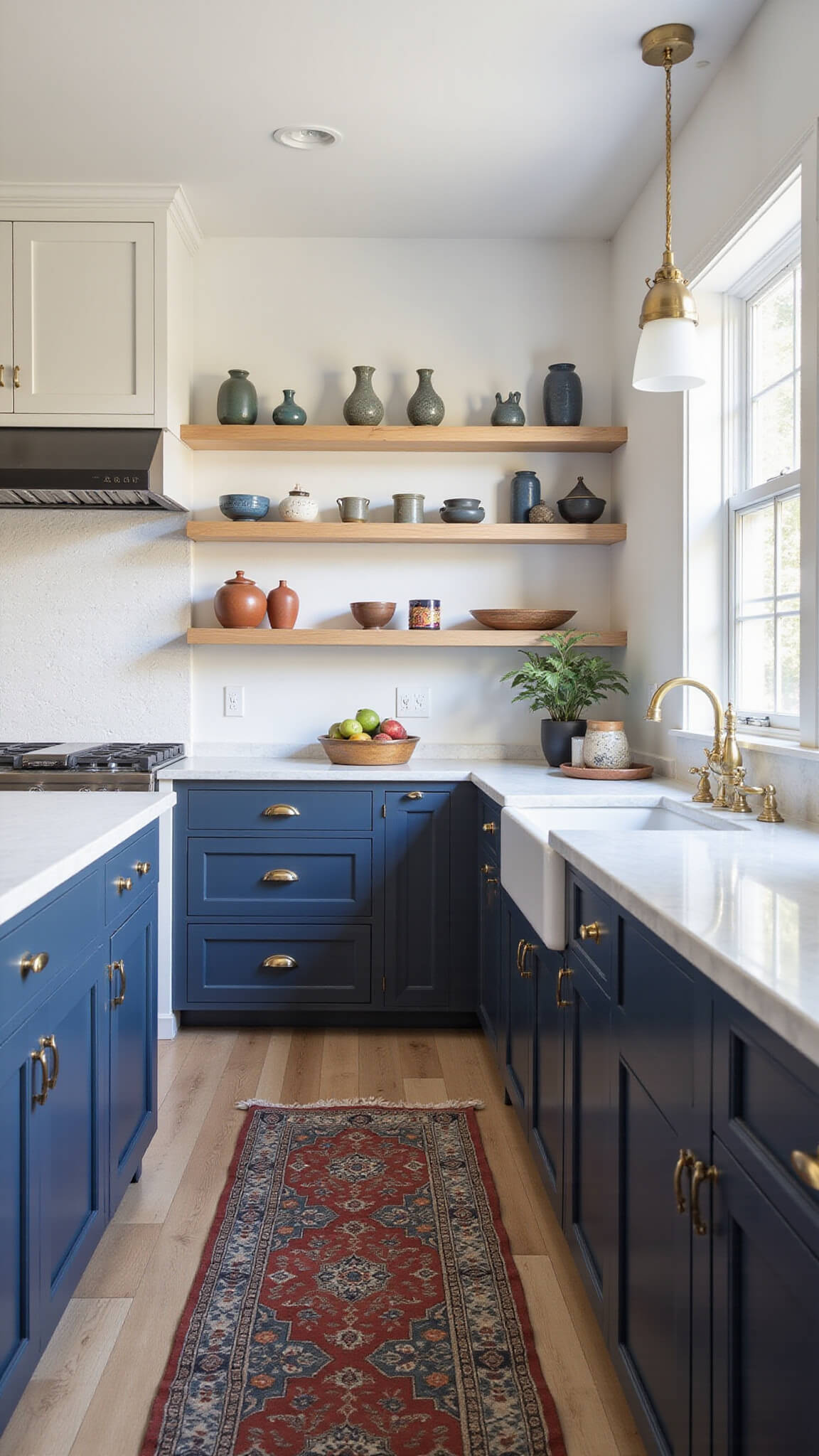
Blues: From Navy to Sky
Blues have taken kitchens by storm in recent years, and for good reason.
Dark Navy by Behr creates a sophisticated, almost tuxedo-like effect when paired with brass hardware. Meanwhile, Blue Nose 1678 offers a more playful vibe without being too casual.
The magic of blue cabinets:
- They work in both traditional and modern spaces
- They hide smudges better than lighter colors
- They create a calming atmosphere
- They pair beautifully with white walls or marble countertops
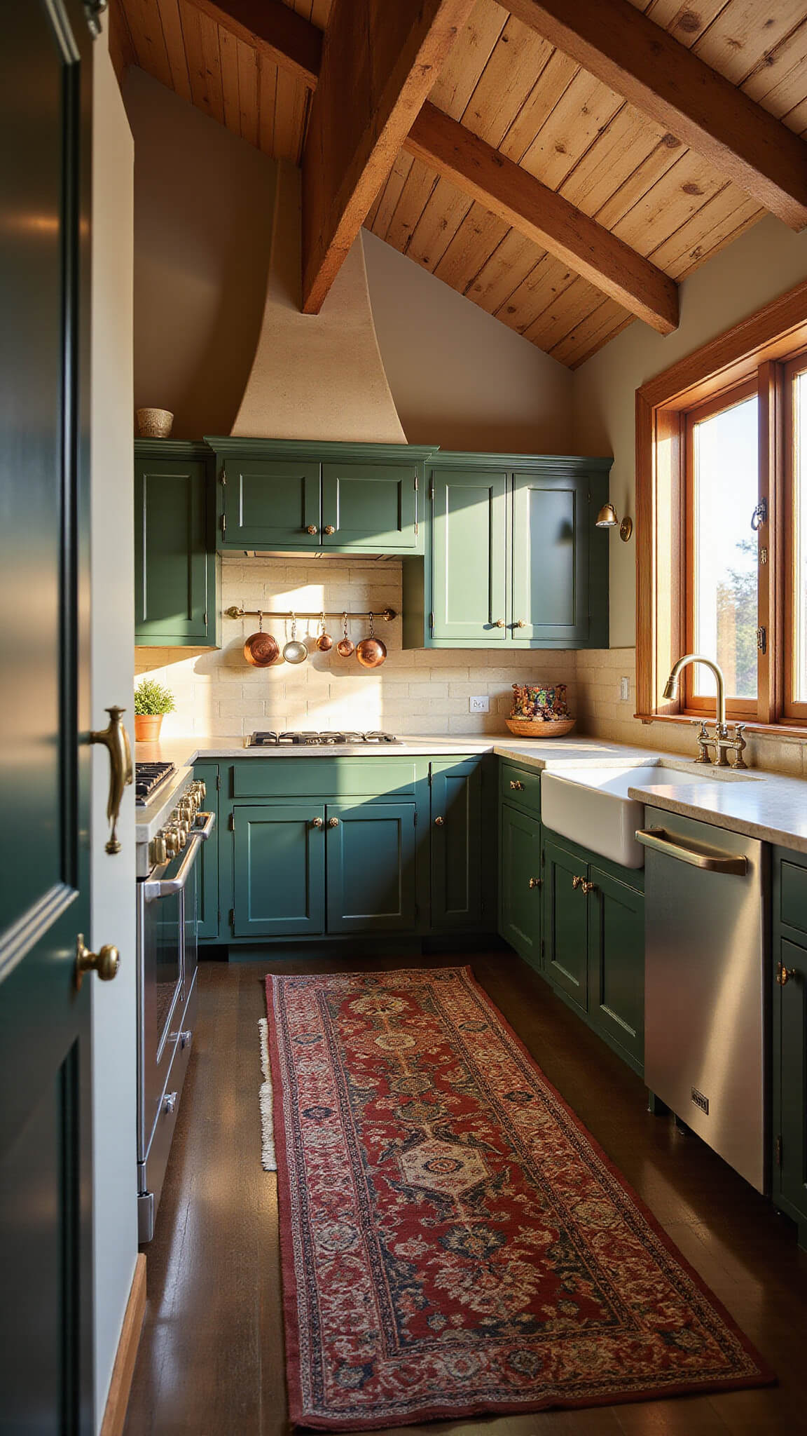
Greens: Bringing Nature Indoors
I painted my island Emerald Balsam 567 last year, and I can’t tell you how many compliments it gets!
Green cabinets offer:
- A connection to nature that makes the kitchen feel alive
- Versatility across different design styles
- A fresh look that doesn’t feel trendy or faddy
- Great contrast with wood elements
Sage green cabinets work particularly well if you’re nervous about going too bold but still want something beyond neutrals.
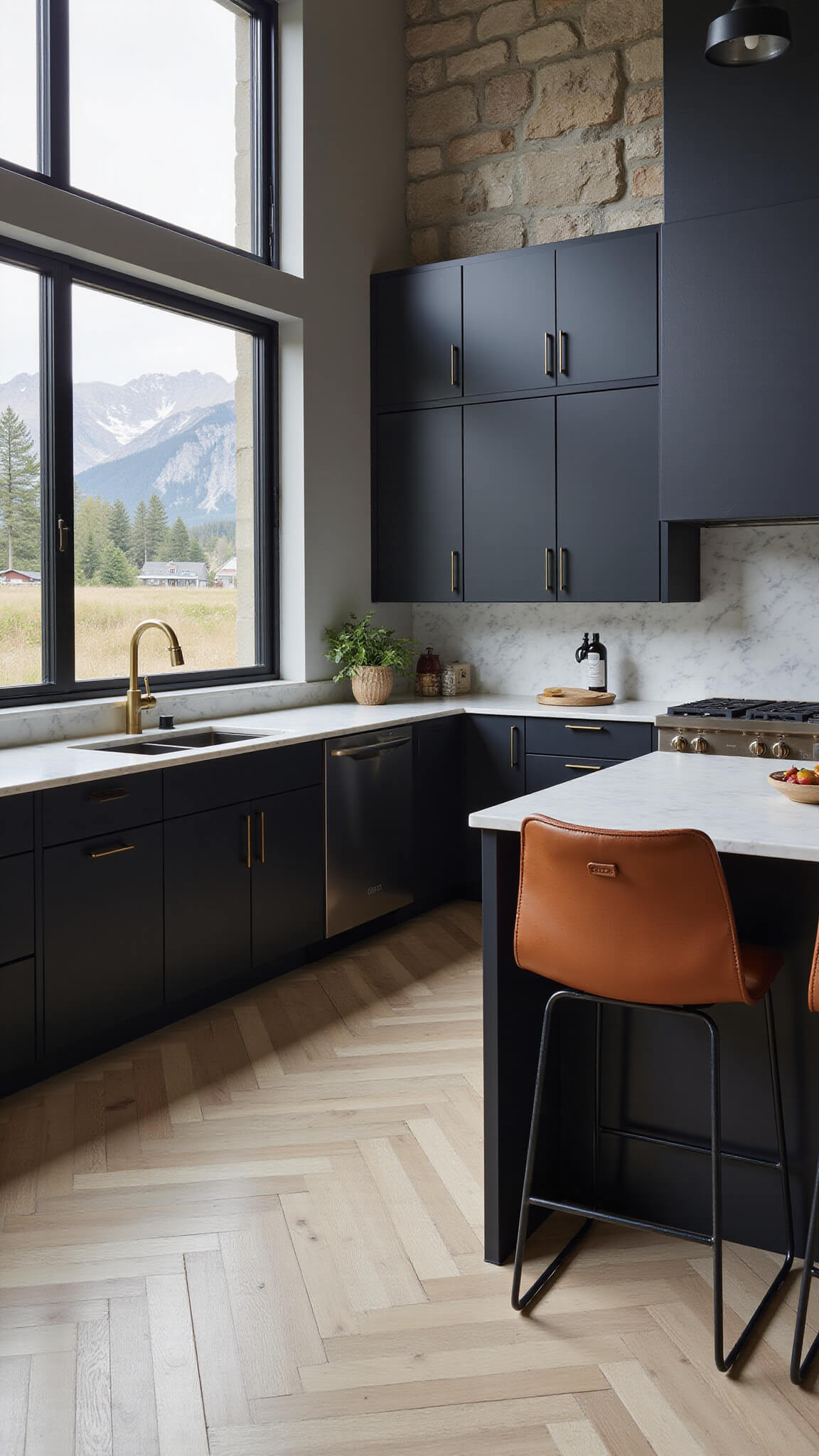
Blacks: The Unexpected Sophisticate
Black cabinets aren’t just for ultra-modern spaces anymore.
When done right, black cabinets can:
- Create a dramatic focal point
- Make other elements pop (like gold hardware)
- Hide cooking splatter better than any other color
- Add sophistication to even the most basic kitchen layout
Word of caution: Black works best in kitchens with plenty of natural light or with strategic lighting to prevent the space from feeling cave-like.
💡 Steal This Look
- Paint Color: Benjamin Moore Simply White OC-117 for upper cabinets with Benjamin Moore Hale Navy HC-154 for lower cabinets creates the classic two-tone kitchen look
- Furniture: natural wood bar stools with brass accents to complement cabinet hardware
- Lighting: brass pendant lights over kitchen island to tie into cabinet hardware
- Materials: quartz countertops in white or marble-look patterns, subway tile backsplash
There’s something deeply satisfying about walking into a kitchen with perfectly chosen cabinet colors that feel both fresh and timeless. These classic combinations have proven their staying power through decades of design trends.
Mixing and Matching: The Two-Tone Approach
Why settle for one cabinet color when you can have two? This growing trend lets you play with color while maintaining balance.
Popular combinations include:
- Navy lower cabinets with white uppers
- Green island with white perimeter cabinets
- Black base cabinets with warm wood uppers
This approach:
- Creates visual interest
- Makes the space feel custom
- Lets you incorporate trends without overwhelming the room
- Helps define zones in open-concept kitchens
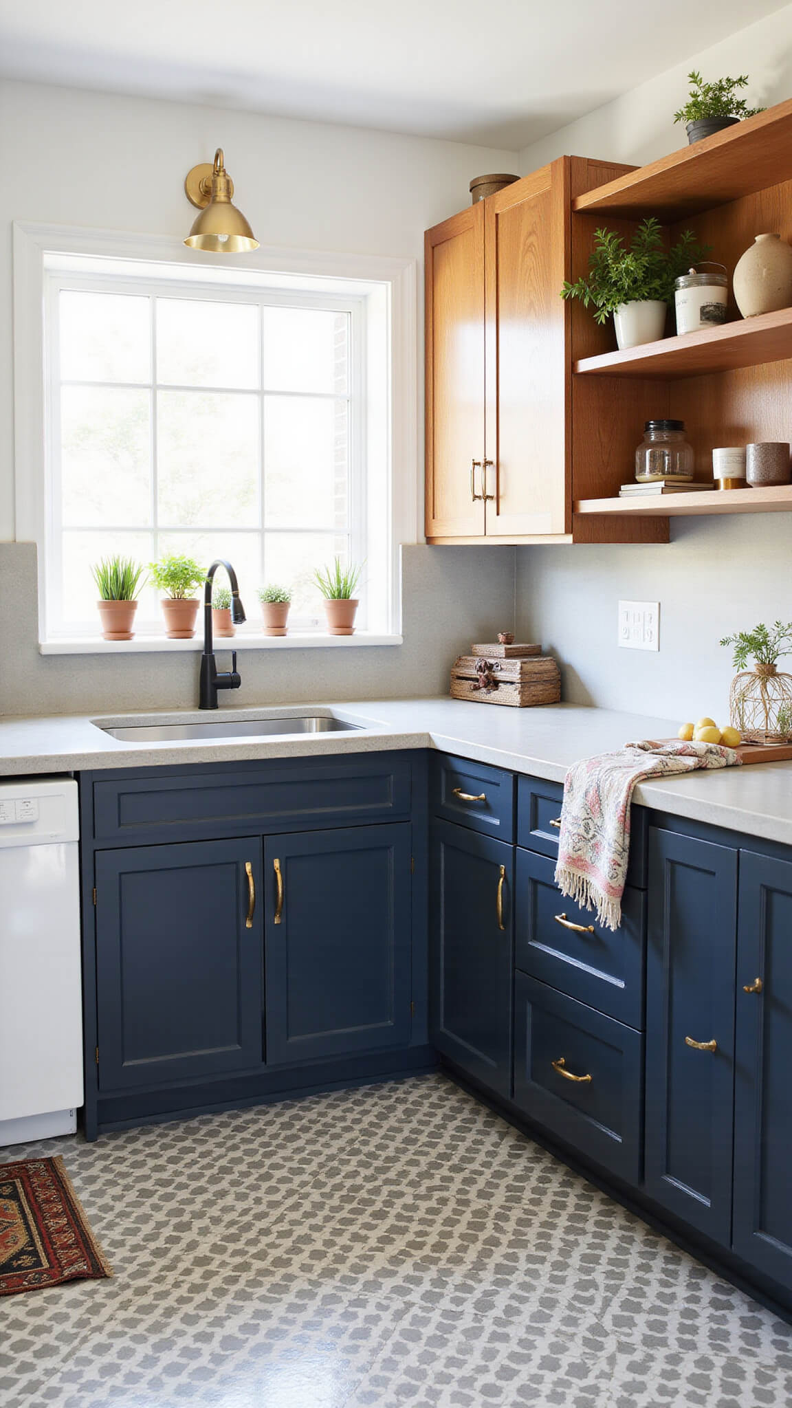
🏠 Steal This Look
- Paint Color: Farrow & Ball Hague Blue No.30 for lower cabinets with Farrow & Ball Pointing No.2003 for uppers – the classic two-tone approach that creates sophisticated contrast while maintaining kitchen cohesion
- Furniture: waterfall edge quartz island in contrasting color, brass bar stools with navy leather seats, open shelving in warm wood tones
- Lighting: pendant lights over island in mixed metals – brass and black finish to bridge the two cabinet colors
- Materials: quartz countertops, subway tile backsplash, brushed brass hardware, natural wood floating shelves
The two-tone cabinet trend gives you permission to be bold without commitment – try that navy you’ve been eyeing on just the island while keeping classic white around the perimeter.
Choosing the Right Cabinet Color for Your Space
1. Kitchen Size Matters
Small kitchens: Lighter cabinet colors generally make the space feel bigger and airier. If you’re working with limited square footage (under 150 sq. ft.), whites, light blues, or pale greens can be your best friends.
Large kitchens: You’ve got more flexibility! Darker colors can add coziness to expansive spaces, preventing them from feeling cold or sterile.
2. Lighting Conditions Change Everything
The same paint color can look dramatically different depending on your lighting. Before committing:
- Test samples in different parts of your kitchen
- Check them at different times of day
- Consider how your artificial lighting affects the color
Morning eastern light tends to cast a blue tinge, while afternoon western light brings out warm tones.
3. Existing Elements That Can’t Be Changed
Unless you’re doing a complete renovation, you’ll need to work with some fixed elements:
- Flooring
- Backsplash
- Countertops
- Appliance colors
Your cabinet color should complement these elements, not fight with them.
💡 Steal This Look
- Paint Color: Behr Ultra Pure White PR-W15 for small kitchens under 150 sq ft, or Behr Cracked Pepper PPU18-01 for large kitchens needing coziness
- Furniture: white shaker-style upper cabinets with contrasting navy blue lower cabinets, or full dark charcoal flat-panel cabinets for spacious layouts
- Lighting: under-cabinet LED strip lighting to showcase cabinet colors accurately, plus pendant lights over islands
- Materials: quartz countertops in complementary tones, subway tile backsplash, brushed brass or matte black cabinet hardware
The right cabinet color transforms your entire kitchen’s personality, whether you’re embracing the spacious feel of white uppers in a cozy galley or making a bold statement with deep charcoal in an open concept space. Your kitchen size and natural light are the secret ingredients that make certain colors sing.
DIY Cabinet Painting: What You Need to Know
Essential Tools:
- High-quality paint brushes and rollers
- Primer specifically for cabinets
- Cabinet paint (not regular wall paint!)
- Sandpaper (various grits)
- Tack cloths
- Painter’s tape
- Drop cloths
- Screwdriver for removing hardware
The Process (Simplified):
- Remove all doors, drawers, and hardware
- Clean everything thoroughly with a degreaser
- Sand all surfaces for better adhesion
- Prime with a high-quality primer
- Sand lightly