Transforming Your Kitchen with Neutral Cabinets: The Ultimate Guide to Timeless Design
I remember when I first renovated my kitchen. The number of cabinet color options made my head spin. After weeks of indecision, I finally understood why neutral kitchen cabinets have remained the cornerstone of timeless kitchen design for decades.
Neutral cabinets aren’t just a safe choice—they’re brilliant. They adapt to changing trends while maintaining their classic appeal. In my 15 years as a home decorator, I’ve never seen a well-executed neutral kitchen go out of style.
Let’s dive into everything you need to know about creating a stunning kitchen with neutral cabinets that’ll make your neighbors green with envy (in the most sophisticated way possible).
🌟 Steal This Look
- Paint Color: Sherwin-Williams Accessible Beige SW 7036
- Furniture: warm wood dining table with upholstered counter-height bar stools in linen fabric
- Lighting: brushed brass pendant lights with clear glass shades over kitchen island
- Materials: quartz countertops in warm white with subtle veining, subway tile backsplash, and natural wood accents
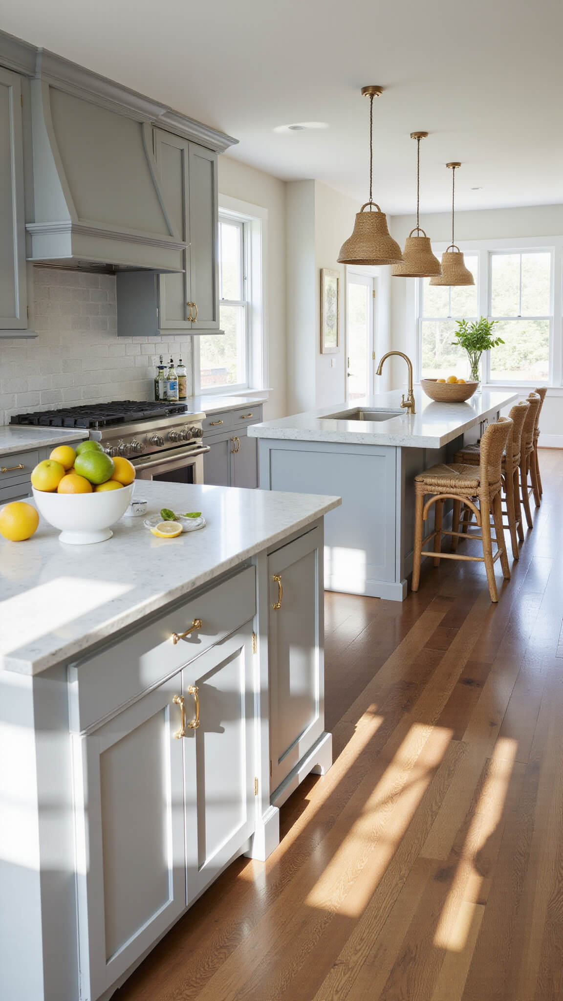
The beauty of neutral cabinets lies in their chameleon-like ability to transform with seasonal styling and evolving trends. I’ve watched clients completely refresh their kitchen’s personality simply by swapping hardware finishes and adding different textiles.
Why Choose Neutral Kitchen Cabinets?
Neutral cabinets offer unmatched versatility. They work in virtually any kitchen size, from tiny apartments to sprawling open-concept spaces.
The best part? You can easily switch up your kitchen’s look seasonally without major renovations. Just swap out accessories, and voilà—whole new vibe.
Top reasons homeowners choose neutrals:
- Timeless appeal that won’t look dated next year
- Higher resale value (real estate agents love neutrals!)
- Flexibility to incorporate trending accent colors
- Creates a sense of spaciousness, especially in smaller kitchens
- Provides a soothing backdrop for daily life
🌟 Steal This Look
- Paint Color: Benjamin Moore White Dove OC-17
- Furniture: marble-top kitchen island with white base, natural wood bar stools with linen cushions
- Lighting: brass pendant lights with clear glass globes over island
- Materials: white quartz countertops, subway tile backsplash, brushed brass cabinet hardware
There’s something deeply satisfying about walking into a kitchen with perfectly balanced neutral cabinets—they feel like a blank canvas that lets your personal style shine through accessories and seasonal touches. It’s the design equivalent of having that perfect white shirt that goes with everything in your closet.
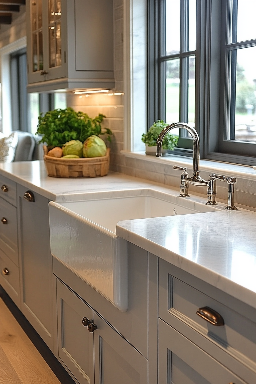
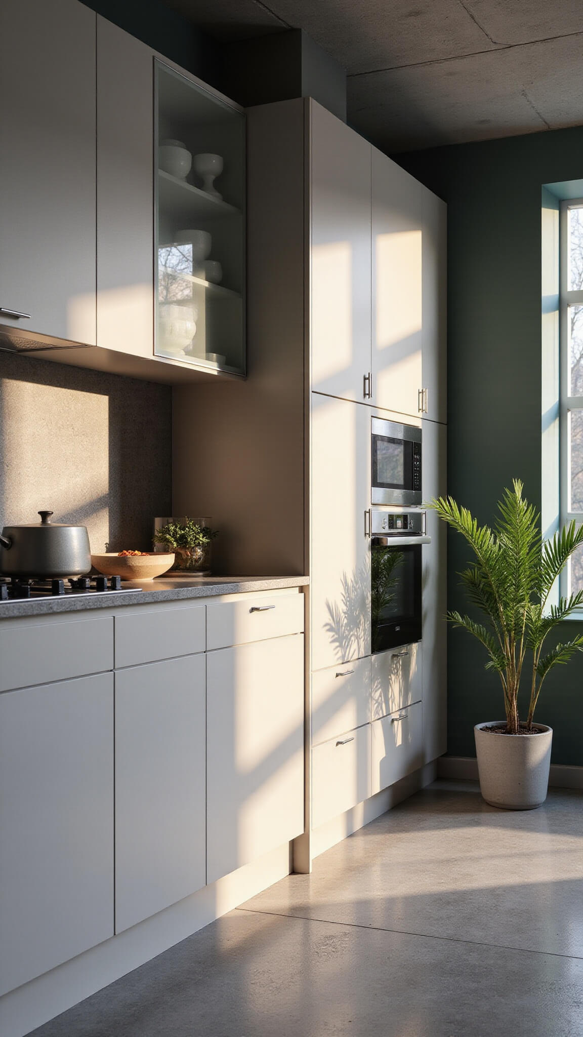
Selecting the Perfect Neutral Cabinet Color
Not all neutrals are created equal. The undertones matter tremendously.
When I first started in design, I made the rookie mistake of thinking “neutral” just meant “white.” Boy, was I wrong. The neutral family includes:
- Whites: From crisp whites to creamy off-whites
- Grays: Light silver to deep charcoal
- Greiges: That perfect gray-beige hybrid that works with everything
- Taupes: Sophisticated brownish-grays
- Earth tones: Soft, muted natural colors
My top neutral cabinet paint picks:
- Benjamin Moore “Classic Gray” – a light warm gray with minimal undertones
- Sherwin Williams “Agreeable Gray” – the perfect greige
- Benjamin Moore “Swiss Coffee” – a warm off-white that never looks stark
- Farrow & Ball “Cornforth White” – a sophisticated light taupe
- Behr “Silver Drop” – a light greige that works in most lighting
Pro tip: Always test your paint colors in your actual kitchen. The lighting in your space dramatically affects how neutrals look. What worked in my north-facing kitchen might look completely different in your sun-drenched space.

💡 Steal This Look
- Paint Color: Farrow & Ball Cornforth White No.228
- Furniture: shaker-style neutral kitchen cabinets with brushed brass hardware
- Lighting: brass pendant lights with clear glass shades over kitchen island
- Materials: warm wood countertops, subway tile backsplash, brushed brass fixtures
I learned this lesson the hard way when my ‘perfect’ greige cabinets looked completely different once installed. Now I always paint large foam boards and live with them for at least a week before making the final decision.
Hardware: The Jewelry of Your Neutral Kitchen
If neutral cabinets are the perfect little black dress, hardware is the statement necklace. This is where you can really have fun!
I’ve found that neutral cabinets look stunning with:
- Matte black hardware – creates dramatic contrast, especially against lighter neutrals
- Brushed brass or gold – adds warmth and a touch of luxury
- Unlacquered brass – develops a beautiful patina over time
- Satin nickel – offers a subtle, sophisticated look
- Cup pulls mixed with knobs – creates visual interest
The hardware transformation is one of the most budget-friendly updates you can make. For under $200, you can completely change the look of your kitchen.
🖼 Steal This Look
- Paint Color: Behr Natural Linen N240-2
- Furniture: white shaker-style kitchen island with butcher block top
- Lighting: brass pendant lights with clear glass shades
- Materials: natural wood countertops, subway tile backsplash, brushed brass accents
I’ve watched countless kitchens transform with just a hardware swap – it’s like watching someone put on the perfect jewelry piece that makes their whole outfit come alive. The right hardware can make $200 feel like a $20,000 renovation.
Styling Your Neutral Kitchen: Beyond the Cabinets
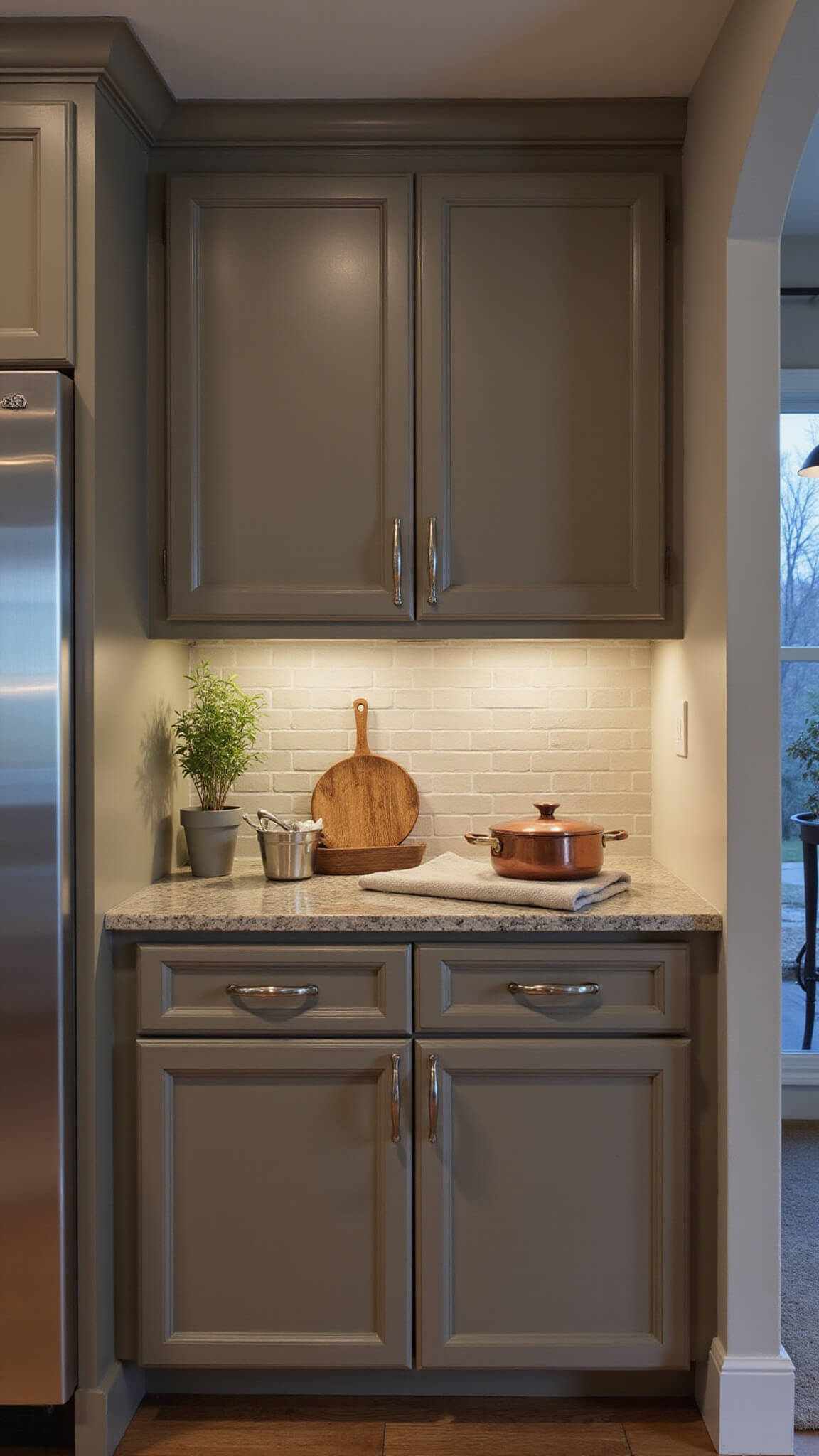
A neutral kitchen doesn’t have to be boring! Here’s how I bring mine to life:
Add texture through:
- Woven baskets on open shelving
- Textured linen dish towels
- Natural wood cutting boards
- Ceramic vases or pitchers
- Handmade pottery in earthy tones
Introduce pops of color with:
- Fresh herbs in terracotta pots
- Colorful cookbooks displayed on counters
- Seasonal fruit in wooden bowls
- Small appliances in accent colors (think: sage green stand mixer)
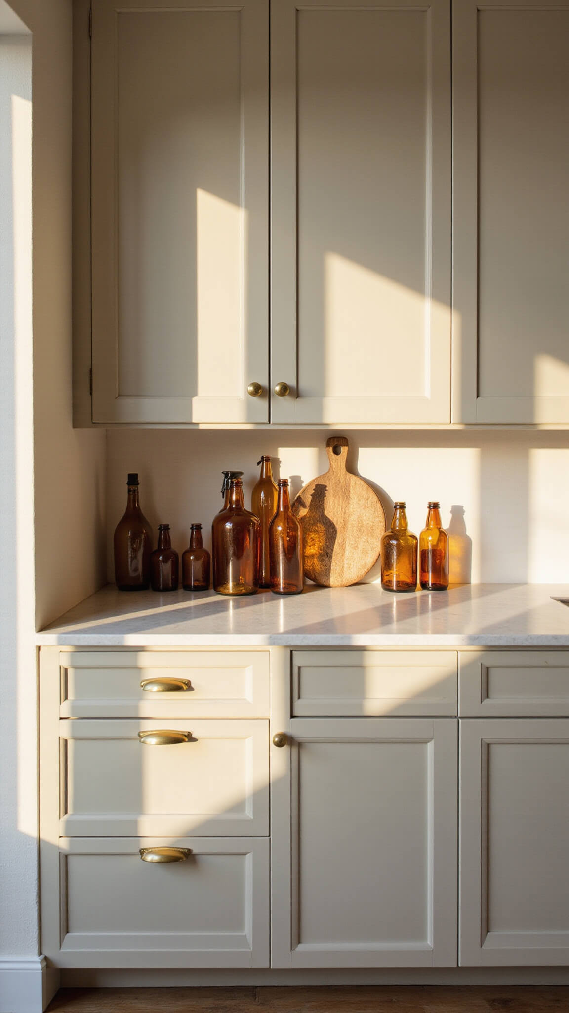
During fall, I swap in amber glass bottles and cinnamon stick bundles. In spring, it’s all about fresh flowers and light blue ceramics. The neutral backdrop makes seasonal changes effortless.
🌟 Steal This Look
- Paint Color: Valspar Swiss Coffee 7006-2B
- Furniture: warm oak open shelving with brass brackets and natural wood kitchen island with butcher block countertop
- Lighting: matte black pendant lights with warm brass accents over island
- Materials: natural linen textures, raw wood cutting boards, handmade ceramics, and woven rattan storage
I love how a neutral kitchen becomes the perfect canvas for seasonal changes – the same space feels completely different with just a few swapped accessories. It’s like having a new kitchen every few months without the renovation cost.
🎁 Get The Look
Photographing Your Neutral Kitchen: Capturing the Magic
If you’re planning to share your kitchen transformation on social media (and you should!), here’s how to capture it beautifully:
Best times to photograph:
- Mid-morning (9-11am) when natural light is bright but not harsh
- Late afternoon during “golden hour” for warm, flattering light
Camera settings for phone photographers:
- Use portrait mode for a professional look
- Turn on grid lines to help with composition
- Tap to focus on cabinet details or styled vignettes
- Slightly underexpose rather than overexpose (you can always brighten in editing)
I like to stage my kitchen with a few thoughtfully placed items before photographing. A wooden board with a loaf of bread, a small vase with fresh herbs, and maybe a linen napkin creates an inviting scene without looking too staged.
- Extra-Long Neutral Kitchen Cabinets
- Neutral Kitchen Cabinets With Remote
- Neutral Kitchen Cabinets 3-Piece
🖼 Steal This Look
- Paint Color: PPG Agreeable Gray PPG1033-2 for walls to complement neutral cabinetry without competing with photography lighting
- Furniture: natural wood cutting boards and linen kitchen textiles for styling
- Lighting: under-cabinet LED strip lighting to eliminate harsh shadows during photography
- Materials: matte cabinet finishes and natural wood accents that photograph beautifully without glare
There’s something magical about capturing your kitchen in that perfect golden hour light – when your neutral cabinets glow warmly and every surface tells the story of your thoughtful design choices.