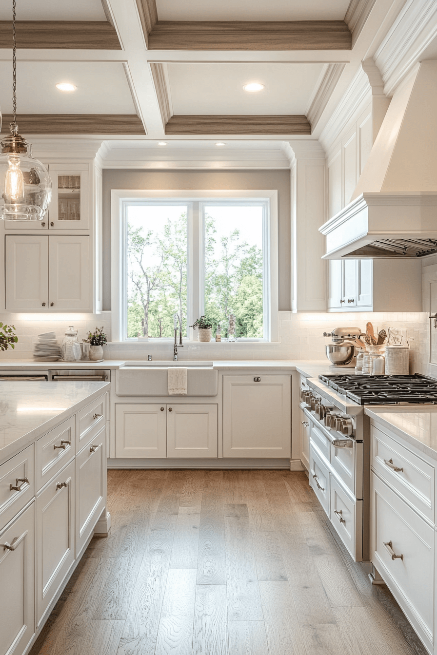
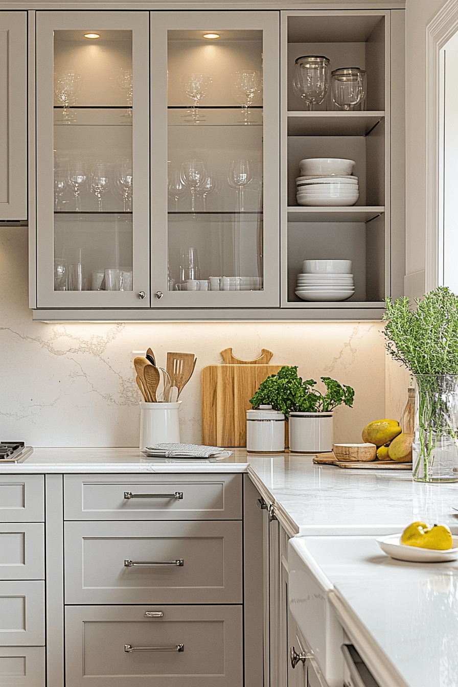
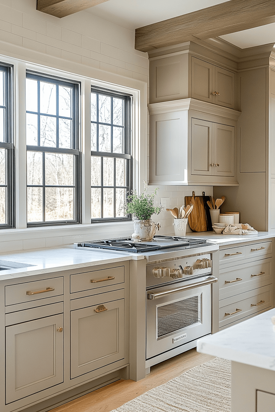
Neutral kitchen cabinets create the perfect foundation for a timeless, versatile cooking space that adapts effortlessly to changing styles and trends. From soft beiges and creamy whites to sophisticated grays and warm taupes, these understated hues offer endless possibilities for personalization while maintaining a calm, welcoming atmosphere. Whether you prefer the airy elegance of ivory tones or the grounded warmth of sand-inspired shades, neutral cabinets provide a sophisticated backdrop that complements any design aesthetic, from modern minimalism to cozy farmhouse charm.
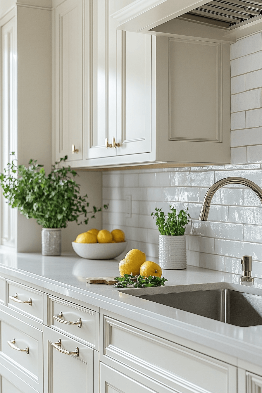
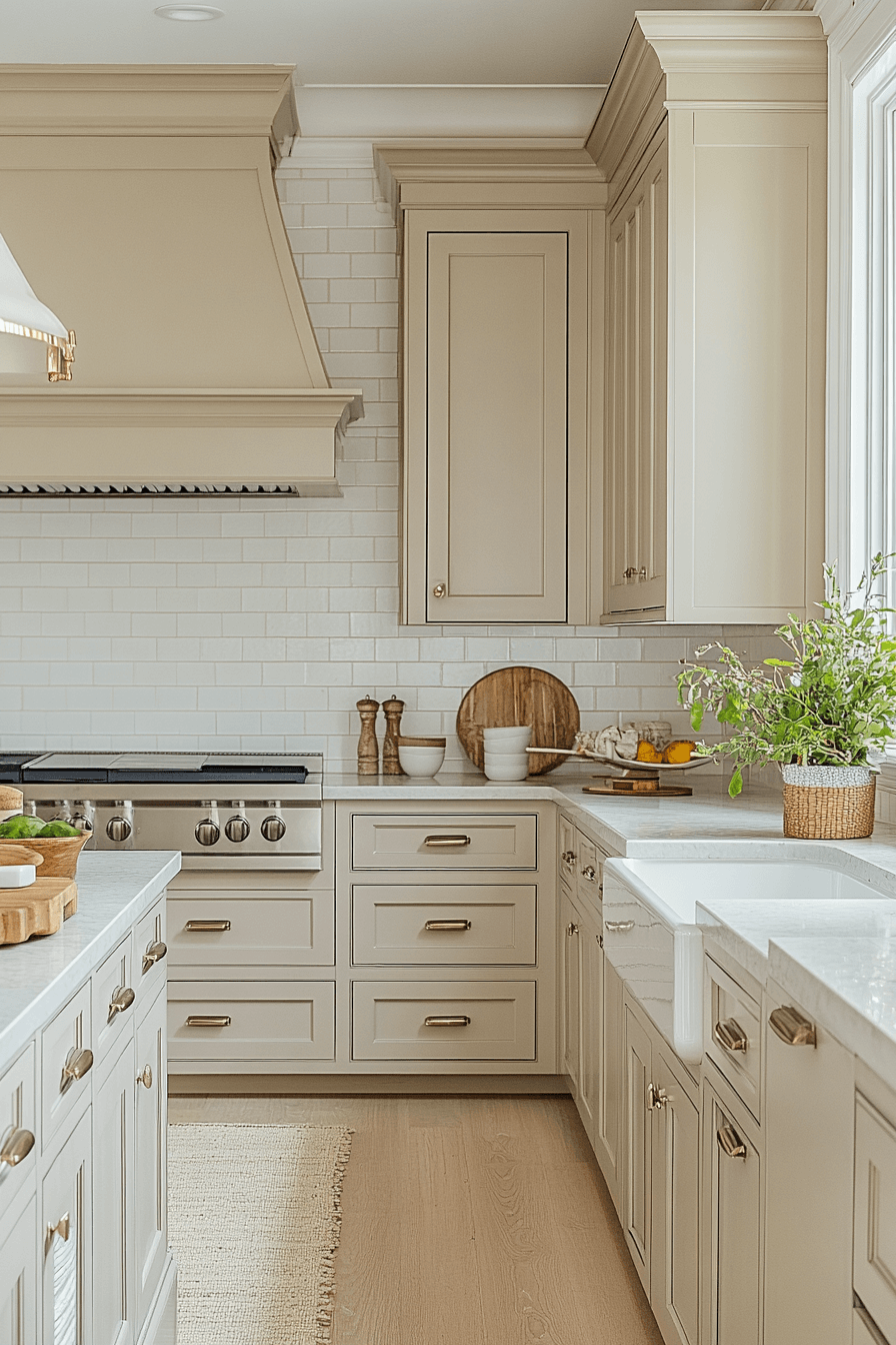
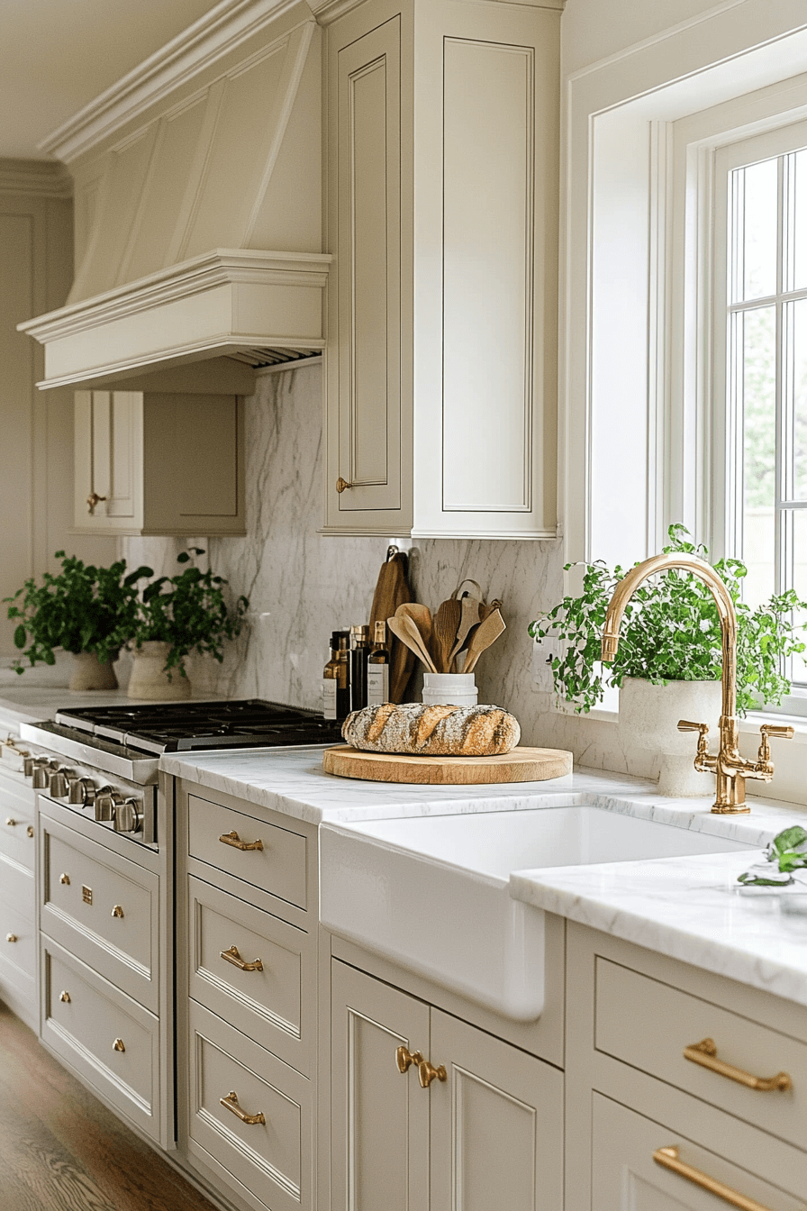
1. Beige Timeless Welcome
Soft beige neutral kitchen cabinets instantly give your kitchen a cozy, welcoming glow that feels easy and effortless. The gentle tone works with nearly any color palette, making updates simple over time. Light bounces naturally around the room, helping the space feel brighter and more open. Styling can stay calm and tonal or lean bold with layered accents and hardware. The look always feels balanced and timeless.
★ Steal This Look
- Paint Color: Sherwin-Williams Accessible Beige SW 7036
- Furniture: warm beige shaker-style kitchen cabinets with oil-rubbed bronze hardware
- Lighting: black metal lantern-style pendant light with clear glass panels
- Materials: warm beige limestone backsplash, light travertine flooring, white quartz countertops
This kitchen proves that beige doesn’t have to be boring when you layer in rich textures like natural stone and warm metal finishes. The soft neutral cabinets create the perfect backdrop for both everyday living and entertaining.
2. Creamy Peaceful Style
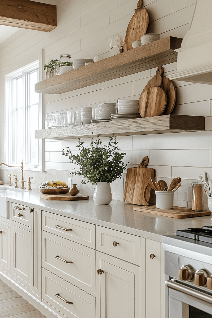
Creamy neutral kitchen cabinets bring a spa-like calm that instantly softens the entire space. Their smooth tone highlights wood grains, stone surfaces, and warm metal finishes beautifully. The color feels light and airy while still offering comfort and depth. It adapts easily to modern layouts and classic kitchens alike. The result is peaceful and polished.
🖼 Steal This Look
- Paint Color: Benjamin Moore Swiss Coffee OC-45
- Furniture: warm wood floating shelves with recessed brackets
- Lighting: natural window light with white painted trim
- Materials: white subway tile backsplash, white quartz countertops, warm oak wood accents
This kitchen perfectly demonstrates how creamy cabinets create a peaceful backdrop that lets beautiful wood cutting boards and shelves shine. The warm undertones feel both modern and timeless.
3. Ivory Open Simplicity
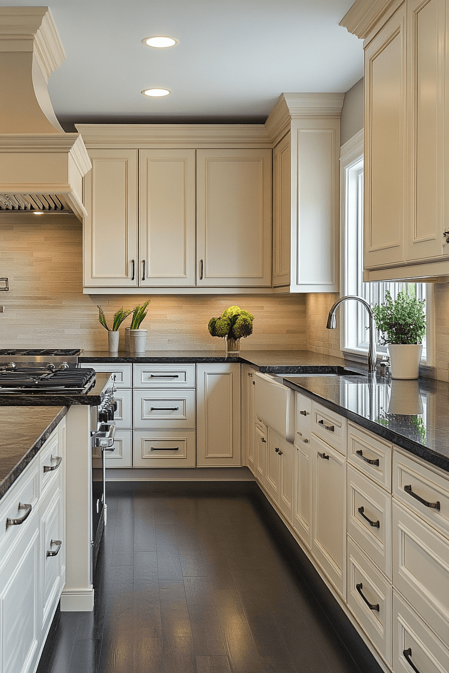
Ivory neutral kitchen cabinets create a clean, modern foundation that still feels inviting and livable. The light shade keeps kitchens feeling spacious, especially in narrow or compact layouts. Simple lines allow hardware, texture, and lighting to shine. Ivory works equally well with bold accents or a soft, tonal palette. The atmosphere stays calm and refined.
✎ Steal This Look
- Paint Color: Farrow & Ball Pointing No. 2003
- Furniture: stainless steel bar stools with leather seats for island seating
- Lighting: recessed LED downlights with warm white temperature
- Materials: dark granite countertops with horizontal subway tile backsplash and rich walnut flooring
This kitchen proves that neutral doesn’t mean boring – the ivory cabinets create a timeless foundation that lets the beautiful materials and thoughtful details take center stage. It’s the kind of space that feels both elegant and entirely livable.
4. Chiffon Airy Charm
Chiffon-inspired neutral kitchen cabinets introduce an airy elegance that feels graceful and timeless. The delicate tone brings softness without fading into the background. These cabinets pair beautifully with dark stone, pale quartz, or natural wood counters. Styling can lean glamorous or understated with equal success. The result always feels polished.
🎨 Steal This Look
- Paint Color: Behr Chic Neutrals N320-1
- Furniture: natural wood bar stools with cushioned seats
- Lighting: recessed ceiling lights with white trim
- Materials: white subway tile backsplash, white marble countertops, brushed nickel hardware
This chiffon-toned kitchen creates the perfect backdrop for both everyday living and entertaining. The soft neutral cabinets feel sophisticated yet approachable, making the space feel larger and brighter.
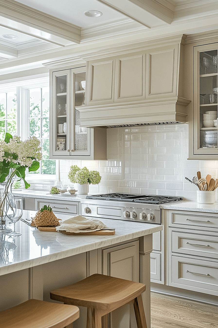
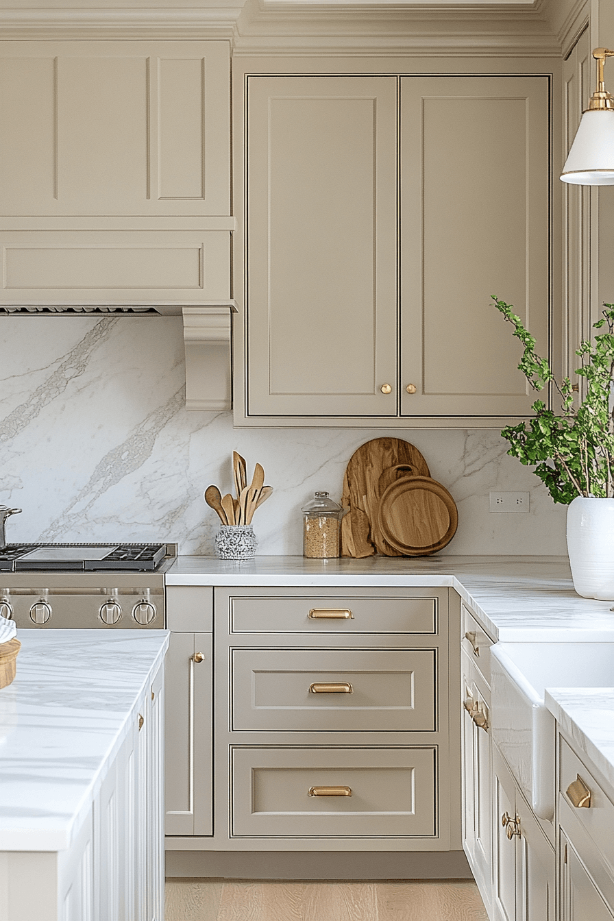
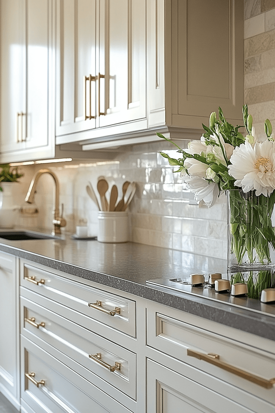
5. Taupe Elegant Warmth
Taupe neutral kitchen cabinets ground the kitchen with warmth and quiet sophistication. The richer neutral adds depth while remaining flexible for changing decor. This shade works beautifully across rustic, transitional, and modern designs. Everyday wear blends in effortlessly, keeping maintenance stress low. The space feels inviting and layered.
★ Steal This Look
- Paint Color: Valspar Coastal Villa 6001-2A
- Furniture: white quartz waterfall island with integrated farmhouse sink and built-in breakfast bar seating
- Lighting: recessed LED ceiling lights with white trim rings
- Materials: wide plank natural oak flooring, white subway tile backsplash, brushed nickel cabinet hardware, marble-look quartz countertops
This taupe kitchen proves that neutral doesn’t mean boring – the rich cabinet color creates incredible depth while still feeling fresh and timeless. It’s the perfect backdrop for both everyday living and special occasions.
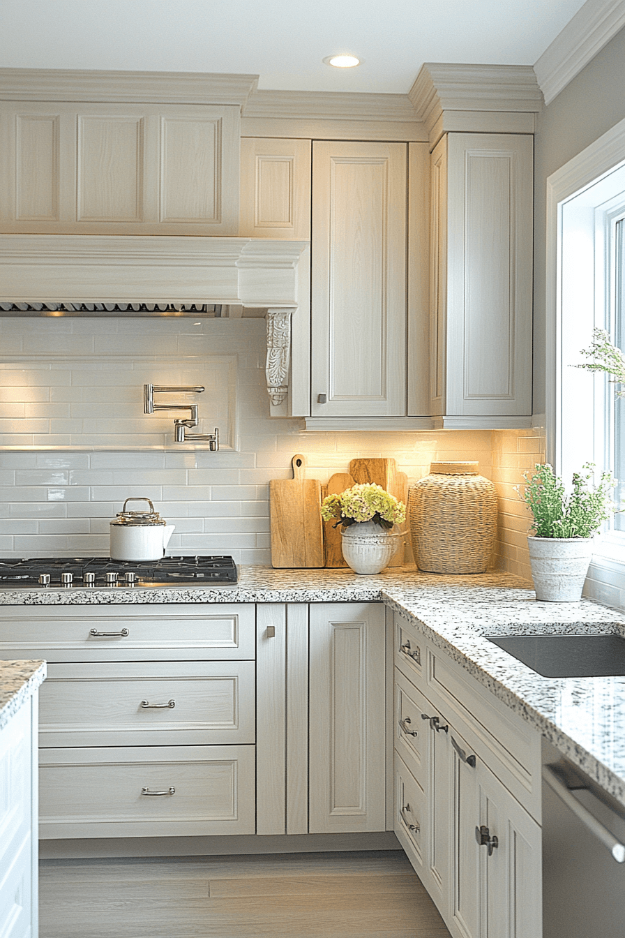
6. Porcelain Clean Bright
Porcelain-inspired neutral kitchen cabinets deliver a crisp, fresh look that instantly brightens the room. Their clean tone reflects light beautifully, helping kitchens feel larger. These cabinets act as a blank canvas for colorful decor or sleek monochrome styling. They adapt effortlessly to bold or minimal aesthetics. The result feels timeless and fresh.
✎ Steal This Look
- Paint Color: PPG White Dove OC-17
- Furniture: white quartz waterfall countertop with undermount stainless steel sink
- Lighting: natural light from window with polished brass cabinet hardware
- Materials: white subway tile backsplash with raised panels and brass accents
This porcelain-bright kitchen proves that white cabinets don’t have to feel cold or boring. The brass hardware and natural styling create warmth that makes the space feel both fresh and inviting.
🌊 Get The Look
7. Sand Natural Comfort
Sand-toned neutral kitchen cabinets bring relaxed, coastal warmth into the heart of the home. The soft brown hue pairs naturally with stone, wood, and woven textures. This color creates a casual, welcoming atmosphere that never feels forced. It shines in sun-filled kitchens and indoor-outdoor layouts. The vibe stays calm and inviting.
🌟 Steal This Look
- Paint Color: Dunn-Edwards Sandy Beach DE6137
- Furniture: light oak shaker-style kitchen cabinets with raised panel doors
- Lighting: recessed LED ceiling lights with under-cabinet LED strip lighting
- Materials: natural stone stacked backsplash, speckled granite countertops, light wood flooring
This sandy neutral palette creates the perfect backdrop for a kitchen that feels both sophisticated and approachable. The warm wood tones invite you to linger over morning coffee and evening conversations.
8. Stone Soft Sophistication
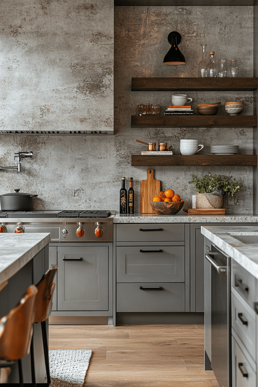
Stone-hued neutral kitchen cabinets introduce subtle gray undertones that feel calm and refined. Inspired by natural rock, the color offers quiet sophistication without heaviness. It’s ideal for adding a touch of edge while staying approachable. These cabinets create a perfect backdrop for bold tile or colorful accents. The look feels balanced and modern.
★ Steal This Look
- Paint Color: Clare Paint Current Mood CC-01
- Furniture: warm wood bar stools with black metal legs
- Lighting: matte black cone pendant sconce with brass interior
- Materials: concrete countertops, walnut floating shelves, weathered plaster walls
This kitchen proves that neutral doesn’t mean boring – the stone-gray cabinets ground the space while allowing the rich textures and warm accents to shine. It’s sophisticated without trying too hard.
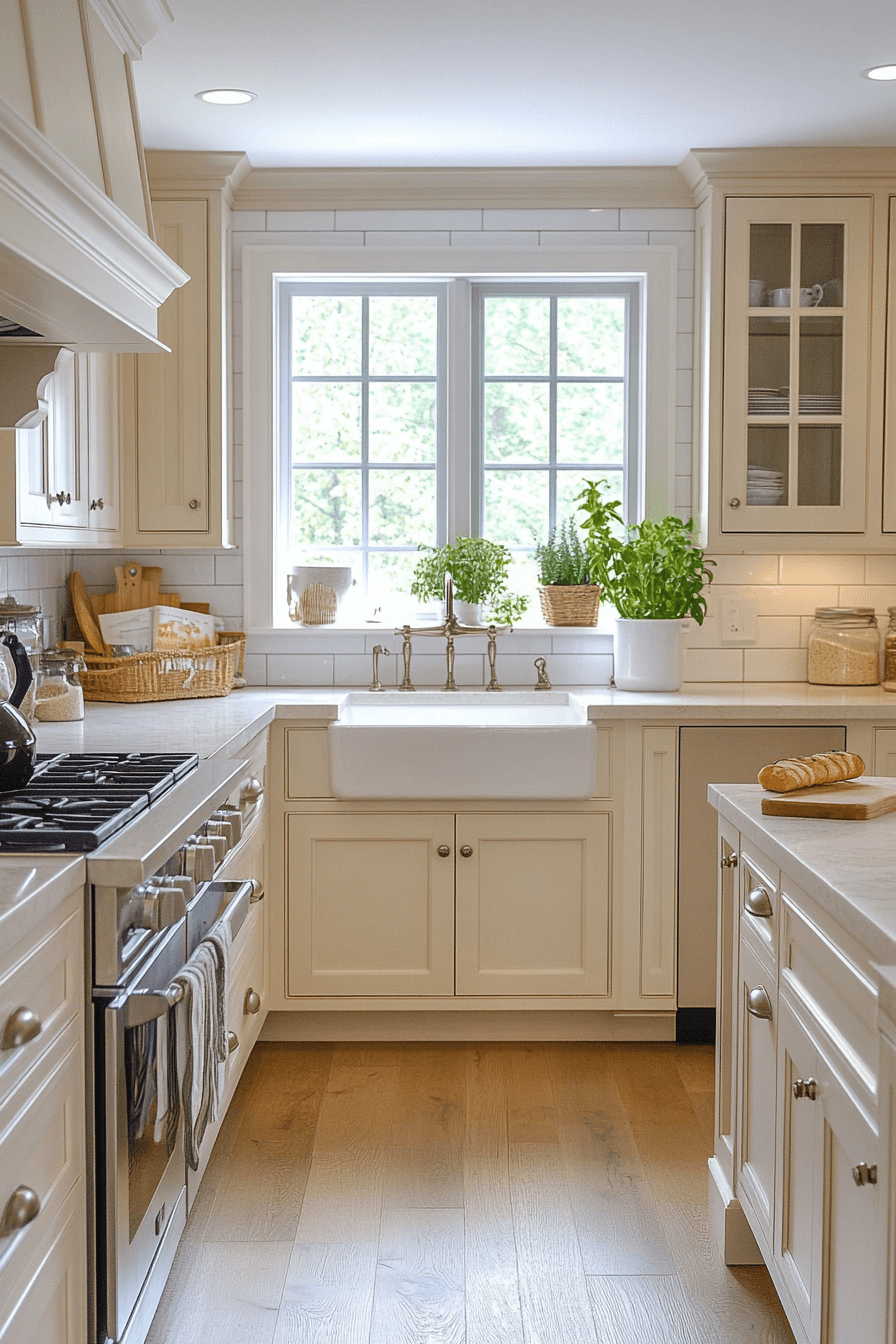
9. White Luminous Calm
Whisper-bright neutral kitchen cabinets create a luminous, clean aesthetic that feels fresh and energizing. Their soft white tone enhances both natural and artificial light. Decor and lighting stand out beautifully against this understated backdrop. The style works just as well in compact kitchens as open layouts. Everything feels light and polished.
🌟 Steal This Look
- Paint Color: Fine Paints of Europe Off-White HC-8
- Furniture: white shaker-style kitchen cabinets with farmhouse sink and kitchen island with seating
- Lighting: recessed ceiling lights with glass globe pendant over island
- Materials: white quartz countertops, white subway tile backsplash, light oak hardwood floors, coffered ceiling with wood trim
This luminous white kitchen proves that neutral doesn’t mean boring – the layered textures and warm wood accents create incredible depth. The coffered ceiling adds architectural interest without overwhelming the clean aesthetic.
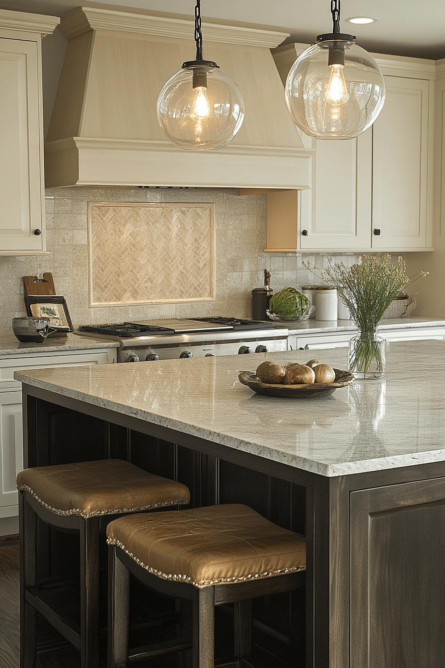
10. Gray Modern Tranquility
Soft gray neutral kitchen cabinets offer a modern alternative to white while keeping the mood calm. This gentle shade adds dimension without overpowering the space. It pairs seamlessly with metals, wood accents, and textured finishes. Light shifts throughout the day add subtle visual interest. The result feels refined and relaxed.
★ Steal This Look
- Paint Color: Backdrop Classic Gray CG-01
- Furniture: white marble waterfall countertop island with gray shaker-style base cabinets
- Lighting: recessed LED puck lights in glass-front upper cabinets
- Materials: polished nickel cabinet hardware, white marble countertops, clear glass cabinet fronts
This soft gray cabinet color strikes the perfect balance between modern sophistication and timeless appeal. The built-in display lighting transforms everyday dishes into design elements.
11. Milky Soft Neutral
Milky off-white neutral kitchen cabinets add warmth while preserving a clean, bright appearance. The tone feels softer than stark white, making the kitchen more comfortable and inviting. It blends easily with farmhouse, transitional, and modern styles. The space feels cozy yet fresh. This shade offers the best of both worlds.
💡 Steal This Look
- Paint Color: Sherwin-Williams Creamy SW 7012
- Furniture: dark walnut kitchen island with leather counter stools
- Lighting: clear glass globe pendant lights with black hardware
- Materials: polished marble countertops, herringbone travertine backsplash, oil-rubbed bronze hardware
This sophisticated palette proves that neutral doesn’t mean boring. The creamy cabinets feel warm and welcoming while the rich island base adds grounding contrast.
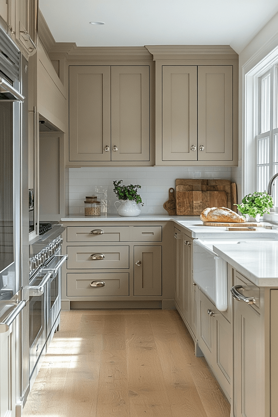
12. Almond Homey Warmth
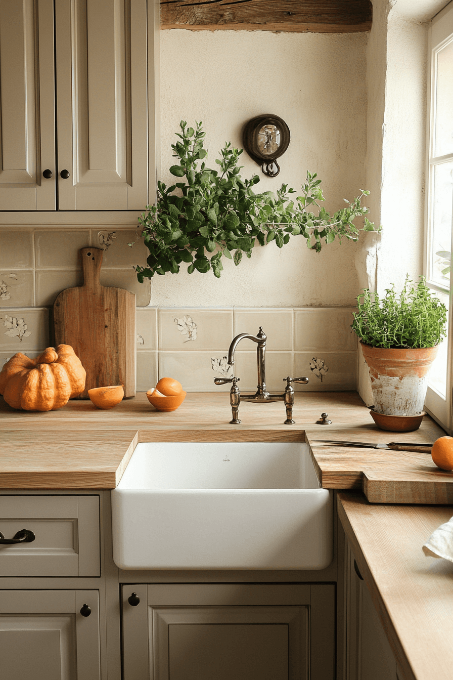
Almond-toned neutral kitchen cabinets instantly make the kitchen feel welcoming and lived-in. The warm hue flows beautifully into open living and dining spaces. Creams, browns, and warm metals pair naturally for a cohesive look. These cabinets turn the kitchen into a natural gathering place. Comfort defines the space.
🌟 Steal This Look
- Paint Color: Benjamin Moore White Dove OC-17
- Furniture: reclaimed wood butcher block countertops and farmhouse sink with lower cabinet storage
- Lighting: natural window light with vintage-style bronze bridge faucet
- Materials: warm wood countertops, white subway tile backsplash, terra cotta planters, and exposed wood beam
This kitchen perfectly captures that homey warmth where family naturally congregates. The almond cabinets create such an inviting backdrop for daily life.
13. Wool Inviting Texture
Wool-inspired neutral kitchen cabinets bring softness and warmth that feels familiar and comforting. The muted beige tone layers beautifully with earthy or pastel accents. This color creates a relaxed environment where people want to linger. The kitchen feels social and cozy without feeling dated. Texture takes center stage naturally.
💡 Steal This Look
- Paint Color: Farrow & Ball Elephant’s Breath No.229
- Furniture: Shaker-style raised panel cabinets with brushed nickel bar pulls
- Lighting: Recessed LED downlights with warm white temperature
- Materials: Speckled granite countertops, white subway tile backsplash, natural wood cutting boards
This kitchen perfectly captures that wool-like softness in the cabinet color – it’s the kind of space that makes morning coffee feel like a ritual. The muted greige tone creates such an inviting backdrop for everyday living.
14. Parchment Subtle Beauty
Parchment-toned neutral kitchen cabinets offer subtle elegance with a hint of vintage charm. The light beige color adds character without weighing the room down. These cabinets can feel ornate or minimal depending on styling. They provide a flexible foundation for refined details. The look stays gentle and curated.
🏠 Steal This Look
- Paint Color: Behr Aged Beige S210-2
- Furniture: brass bar stools with woven seats
- Lighting: brass swing-arm wall sconces
- Materials: white marble countertops and white subway tile backsplash
This parchment palette creates that coveted collected-over-time feeling that makes a kitchen feel like the heart of a well-loved home. The gentle beige tone bridges traditional and contemporary styles effortlessly.
🌊 Get The Look
15. Canvas Bright Freedom
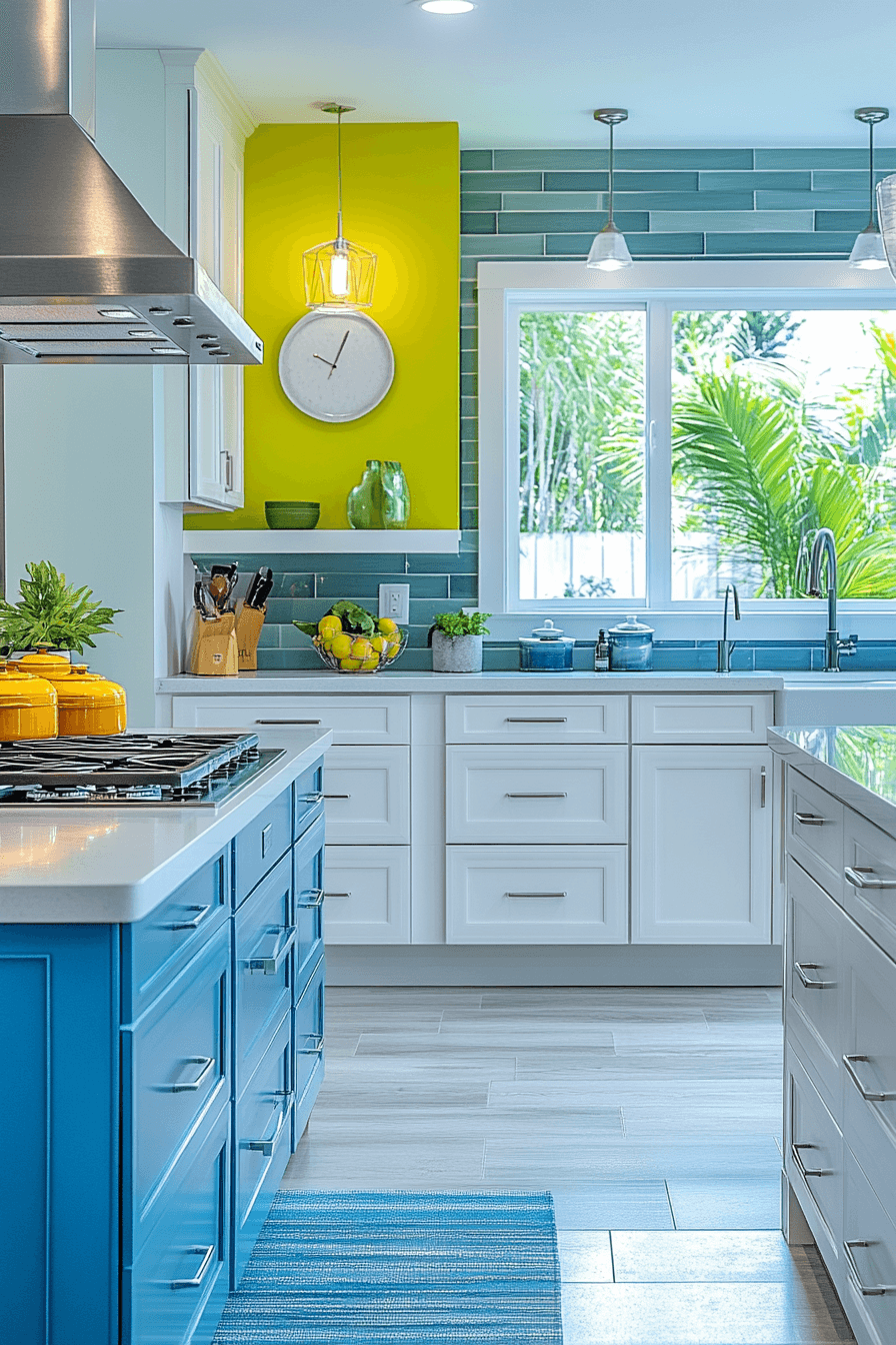
Canvas-clean neutral kitchen cabinets create a bright foundation for creative styling. The fresh tone makes kitchens appear larger and more open. Seasonal decor and bold accents shine effortlessly against this backdrop. The style works beautifully in minimalist and Scandinavian-inspired spaces. Flexibility becomes the highlight.
★ Steal This Look
- Paint Color: Valspar Chartreuse V042
- Furniture: white shaker-style kitchen cabinets with brushed nickel hardware
- Lighting: yellow wire cage pendant lights and clear glass cone pendants
- Materials: teal subway tile backsplash and light gray wood-look flooring
This kitchen perfectly demonstrates how neutral cabinets become the perfect canvas for bold expression. The bright yellow accent wall energizes the space while the clean white cabinetry keeps everything grounded and timeless.
16. Cream Gentle Glow
Cream-washed neutral kitchen cabinets add a barely-there warmth that feels uplifting and elegant. The tone opens up smaller kitchens while maintaining comfort. It pairs beautifully with glossy tile, rustic wood, or matte finishes. The result feels soft and refined. Subtle beauty defines the space.
✎ Steal This Look
- Paint Color: PPG Balanced Beige PPG1073-3
- Furniture: white marble waterfall countertop island with brass bar stools
- Lighting: brass and white cone pendant light
- Materials: Calacatta marble backsplash, brass cabinet hardware, light oak flooring
This cream cabinet kitchen proves that neutral doesn’t mean boring – the gentle warmth creates an inviting space that feels both timeless and fresh.
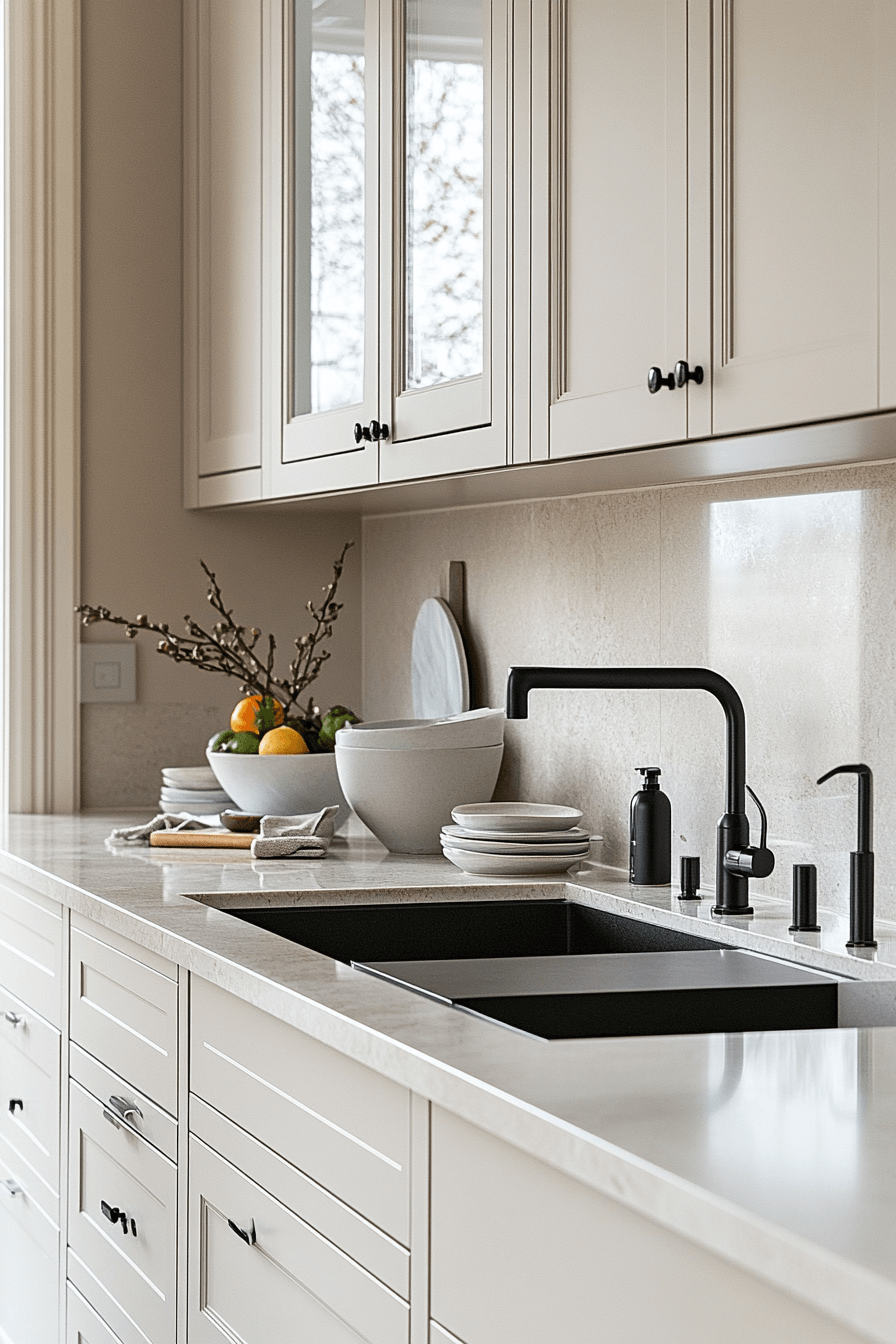
17. Neutral Perfect Balance
Perfectly balanced neutral kitchen cabinets sit comfortably between warm and cool tones. This adaptability allows the kitchen to evolve as trends change. The color grounds eclectic styling or enhances minimalist design. Long-term flexibility makes it a smart investment. The atmosphere stays calm and cohesive.
★ Steal This Look
- Paint Color: Dunn-Edwards Elephant Gray DEC791
- Furniture: warm walnut wood upper cabinets with horizontal grain pattern
- Lighting: geometric copper wire pendant lights with Edison bulbs
- Materials: dramatic white marble with gray veining backsplash and light gray textured lower cabinets
This kitchen proves that neutral doesn’t mean boring – the sophisticated interplay between warm walnut and cool gray creates a timeless foundation that works with both modern and traditional accessories.
18. Sepia Warm Nostalgia
Sepia-inspired neutral kitchen cabinets blend nostalgic warmth with modern refinement. The deeper beige tone adds richness without going dark. Updated fixtures keep the look fresh and current. This shade creates an inviting setting for cooking and entertaining. Character fills the room naturally.
★ Steal This Look
- Paint Color: Clare Paint Current Mood C11 – warm neutral beige that matches the sepia-inspired cabinet tone with subtle depth
- Furniture: Brass cabinet hardware pulls and handles in geometric linear design
- Lighting: Under-cabinet LED strip lighting with warm tone temperature
- Materials: Dark speckled quartz countertops, white subway tile backsplash, warm brass metal finishes
This sepia-inspired kitchen strikes the perfect balance between vintage charm and contemporary function. The warm neutral cabinets create an inviting backdrop that feels both timeless and fresh.
19. Flax Quiet Refinement
Flax-colored neutral kitchen cabinets introduce an organic gray-beige tone with quiet sophistication. The color shifts gently with changing light throughout the day. It pairs beautifully with cool palettes and modern finishes. The look feels natural yet polished. Balance defines the aesthetic.
🏠 Steal This Look
- Paint Color: Fine Paints of Europe Flax F9-18
- Furniture: cream ceramic bowls and white dinnerware set
- Lighting: natural light from glass-front cabinets
- Materials: white quartz countertops with subtle veining and matte black cabinet hardware
This flax cabinet color creates the perfect neutral backdrop that feels both modern and timeless, shifting subtly from gray to beige as natural light changes throughout the day.
20. Oatmeal Soft Comfort
Oatmeal-toned neutral kitchen cabinets combine warmth and softness for a comforting effect. This versatile shade works effortlessly with stone, marble, or butcher block. The kitchen becomes a welcoming place for conversation and connection. Calm energy fills the space. Comfort takes the lead.
🎨 Steal This Look
- Paint Color: Backdrop Oatmeal 1012
- Furniture: white farmhouse sink with brass bridge faucet and warm wood cutting boards
- Lighting: recessed ceiling lights with warm white LED bulbs
- Materials: white subway tile backsplash, white quartz countertops, light oak hardwood floors
There’s something incredibly soothing about an oatmeal-toned kitchen that makes you want to linger over morning coffee. This soft neutral creates the perfect backdrop for gathering and cooking together.
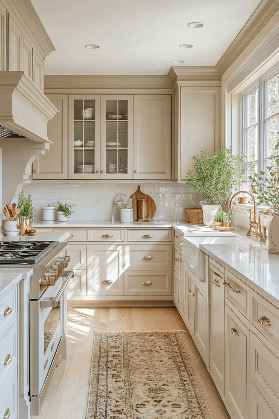
21. Linen Fresh Light
Linen-inspired neutral kitchen cabinets offer a breezy, light-filled look that feels timeless. The soft tone enhances openness and brightness. These cabinets complement everything from coastal to modern styles. The backdrop remains fresh year after year.
🏠 Steal This Look
- Paint Color: Sherwin-Williams Accessible Beige SW 7036
- Furniture: warm beige shaker-style kitchen cabinets with brass bar pulls
- Lighting: natural light from black-framed double-hung windows
- Materials: white subway tile backsplash, white quartz countertops, natural wood ceiling beams, light oak hardwood flooring
This warm beige cabinet color strikes the perfect balance between sophisticated neutrality and welcoming warmth. The linen-fresh tone creates an timeless backdrop that feels both classic and contemporary.
✅ Get The Look
22. Cashmere Elevated Calm
Cashmere-toned neutral kitchen cabinets add quiet luxury with a soft, high-end feel. The warm gray hue pairs beautifully with marble and brushed metals. Statement lighting shines against this refined backdrop. The space encourages relaxation and enjoyment. Elegance feels effortless.
🖼 Steal This Look
- Paint Color: Benjamin Moore Revere Pewter HC-172
- Furniture: farmhouse sink with apron front design
- Lighting: brass bridge faucet with cross handles
- Materials: Carrara marble countertops and backsplash with warm brass hardware
This kitchen perfectly captures that cashmere elegance with its soft gray-beige cabinets that feel both timeless and contemporary. The marble veining and brass accents elevate the neutral palette into something truly special.
👑 Get The Look
23. Ash Contemporary Edge
Ash-toned neutral kitchen cabinets deliver sleek sophistication with a modern edge. The cool gray shade feels polished without becoming sterile. Stainless steel and bold accents pair beautifully here. The result feels contemporary and confident.
✎ Steal This Look
- Paint Color: Farrow & Ball Pavilion Gray 242
- Furniture: sleek bar stools with stainless steel bases
- Lighting: recessed LED downlights with adjustable trim
- Materials: horizontal wood grain laminate, stainless steel appliances, large format gray tile flooring
This ash-toned kitchen proves that neutral doesn’t mean boring – the horizontal wood grain texture adds visual interest while keeping the palette sophisticated. The seamless integration of stainless steel creates a restaurant-quality feel that’s perfect for serious home cooks.
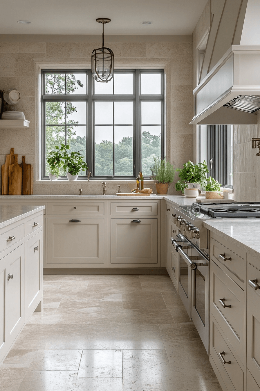
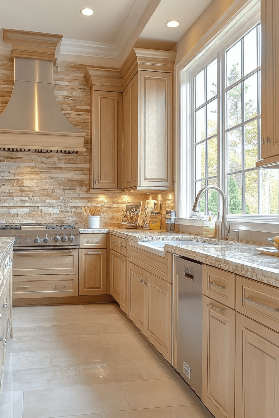
24. Buff Natural Warmth
Buff-colored neutral kitchen cabinets wrap the kitchen in warmth and natural glow. The soft beige tone creates an inviting, relaxing environment. It blends seamlessly with wood, stone, and metal finishes. The kitchen becomes the coziest space in the home. Comfort leads the design.
Neutral tones can instantly soften the look and feel of a kitchen. With these 24 neutral kitchen cabinets you can create a space that feels calm comfortable and easy to enjoy every day. Gentle colors help the room feel open while still feeling warm and inviting. These ideas show how simplicity can bring a soothing and happy atmosphere. Save your favorites and start creating a kitchen that feels soft and feel good from the moment you walk in.
🎨 Steal This Look
- Paint Color: Behr Smoky White PPU18-07
- Furniture: white quartz waterfall island with integrated breakfast bar and brass bar stools
- Lighting: recessed LED ceiling lights with brass kitchen pendant lights over island
- Materials: white subway tile backsplash, brass cabinet hardware, light oak hardwood floors, and natural fiber area rug
There’s something so calming about buff cabinets that makes you want to linger in the kitchen with your morning coffee. This soft, creamy tone creates the perfect backdrop for both everyday cooking and special gatherings.